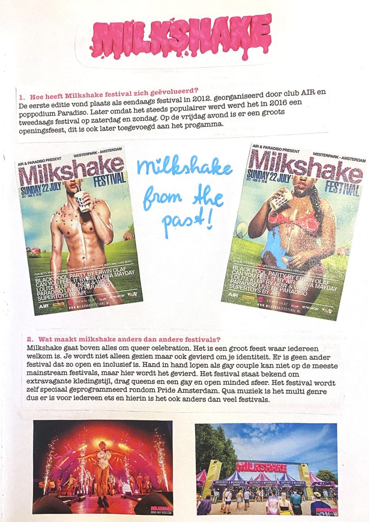
Milkshake is the festival I chose to make a campaign for the in the third project in my first year. There was a list of festivals to choose from and I chose milkshake festival because it suits me very well. It’s bright, it’s fun, it’s whimsical and queer just like me. I created a brand identity and within that identity a logo, an app prototype and a day paper.
processbook
process
I started this project by researching with the help of a head and sub-questions. My head question was what is Milkshakes vibe? And I answered this by answering my sub questions.
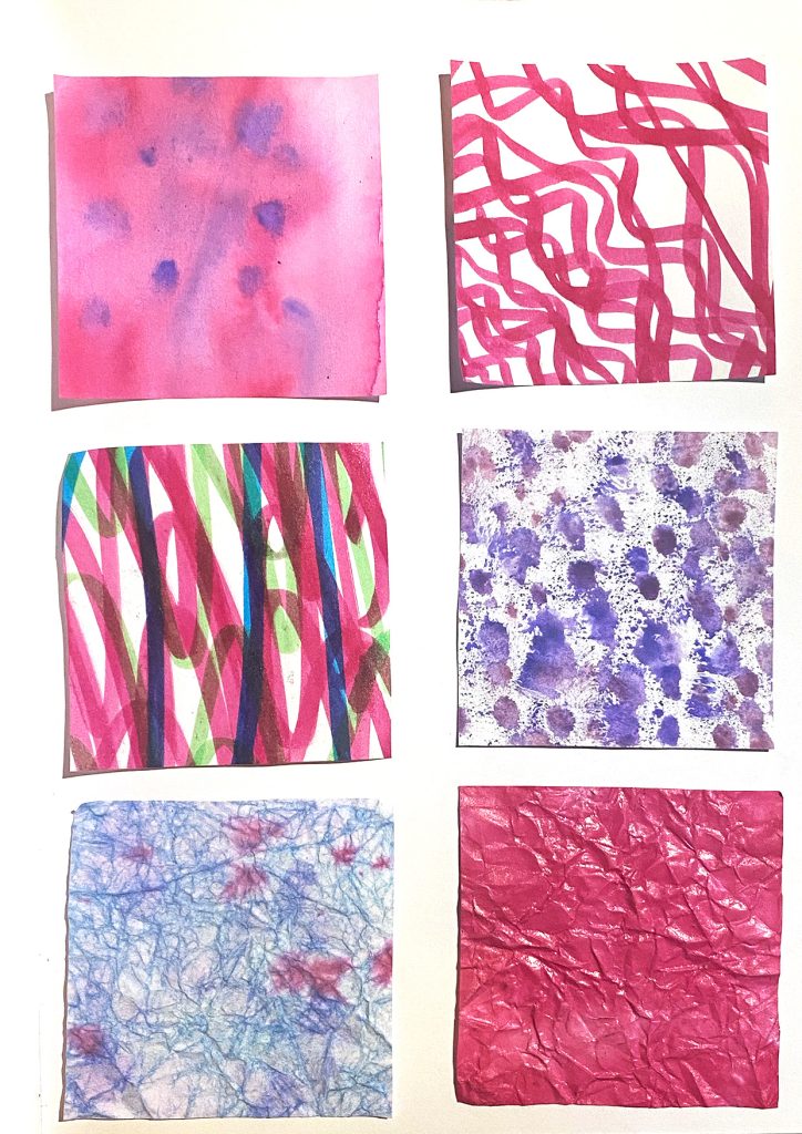
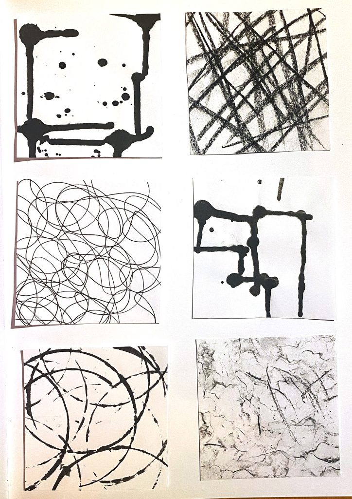
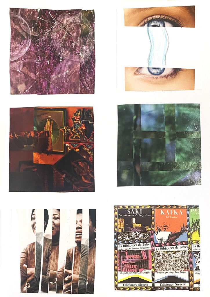
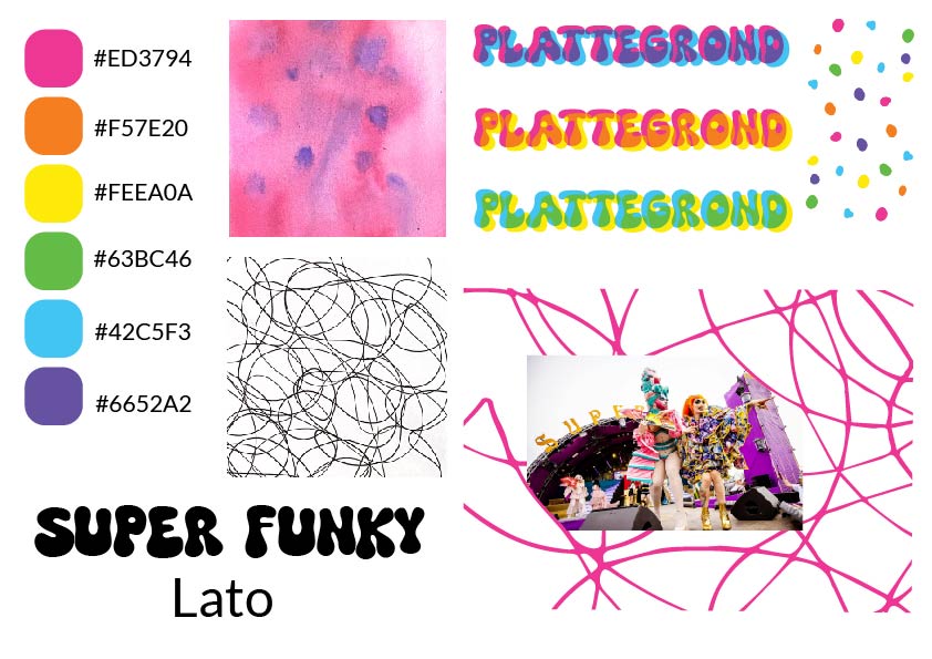
The main brand value that came out of this research is connection. So with that in mind I made 16 different experiments to figure out different shape aspects I might want to use in my brand identity. There’s 3 categories of experiments: color, black and white/lines and pre existing images.
experiments
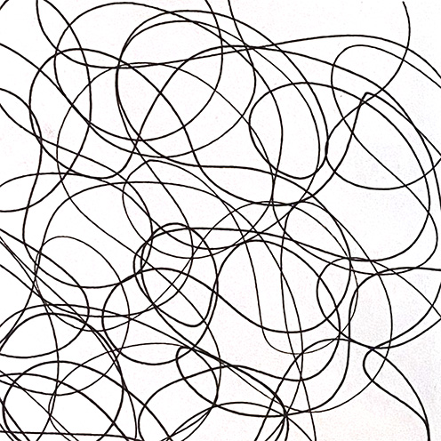
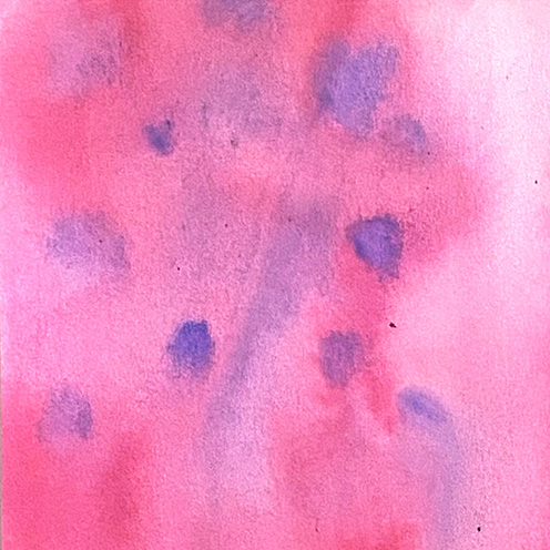
I then picked two out of the 16 that I felt were most cohesive with the theme of connection. The layered colours and interlocking swirling lines of these two experiments felt most like connection because the lines are literally connecting with one another and the overlapping colours bleed into each other connecting with being exactly the same.
I then experimented with the actual design elements in text and photo’s. Layering different colours over top one another in text and images. I ended up going with this bright rainbow esc colour palette both based on my experiments and the connection of queerness to the festival. You’ll find these colours in pretty much every aspect of the identity.
finalyse
You can see that the squiggly lines from my experiment are really integrated in the style of the spreads. They make up both the background and create cutouts in the photos. I made the day paper in Indesign and the cover illustration in Illustrator. I’m actually really happy with how this turned out! I feel like it suits both the style of the festival and my personal style very well.
day paper
app
You can see that the squiggly lines from my experiment are really integrated in the style of the spreads. They make up both the background and create cutouts in the photos. I made the day paper in Indesign and the cover illustration in Illustrator. I’m actually really happy with how this turned out! I feel like it suits both the style of the festival and my personal style very well.